The 2018 Home Decor Trends Designers are Buzzing About
BWS Design • January 9, 2018

Each New Year, we’re inspired to de-clutter and refresh our homes, and 2018 is not likely to be an exception, and when you hear what designers are forecasting in terms of home design and decor for the New Year, we bet you’ll be inspired to do a little interior “overhauling” of your own!

Floral Prints

If you love florals, 2018 is your year, at least in terms of interior design. Designers are predicting that florals — especially large-scale florals as seen on  these beautiful draperies  — will be popping up everywhere from window treatments to throw pillows to bedding. Heck — they’ll even be showing up in totally  unexpected ways !

The Statement Floor

Taking its cues from the accent or statement wall, 2018 will be the year of the statement floor. You’ll see gorgeous patterned floors from parquet and  herringbone wood floor  designs to  exotic printed tiles. (Keep patterned tiles from becoming dated in the coming years by sticking to tried-and-true classic color combos like black and white or other neutral pairings.)

Say Goodbye All-White Kitchens and Hello to More Color and Texture

Color is taking over kitchens in 2018, say designers. But if you — like many — love the look of a white kitchen, there’s no need to gut it and start from scratch. To bring your white kitchen into the New Year, all you need is the addition of a little color. According to the real estate pros at Zillow,  blue kitchens are hot sellers , so why not add a blue tiled backsplash or paint the island a warm, rich blue-gray? You can even paint the walls blue or simply  add some lively blue accents  if there’s not a lot of room in your budget.

Warm Up Your Neutrals

There’s always a place for neutrals in interior design because they’re so versatile. In 2018, though, neutrals will take a decidedly  warmer vibe , with warm — as opposed to cool — grays, and rich, earthy browns,  rusts  and camel — even warmed-up reds!

Rethink Metal Accents

One of the least expensive ways to update your kitchen or bath is by replacing faucets, and matte black is on track to be the most popular choice for 2018. But don’t stop there, try matte  metal cabinet hardware  and drawer pulls, as well as  matte metal pendant lights  in the kitchen or sconces in the bathroom. All are relatively inexpensive ways to update your rooms for the New Year!

Consider Using Concrete on the  Inside  — and Not Just on the Patio!

According to the designers the folks at Houzz consulted with about 2018 design trends, concrete accents are going to be BIG in 2018, and we’re not talking about walkways.  Concrete tile floors , concrete countertops, furniture and accessories will all be making an appearance in American homes this year. You can even get the look of concrete with “faux” concrete wallpaper if you’re not keen on replacing a floor or a kitchen countertop!

Nothing Says 2018 Like a New (Non-White, Non-Stainless Steel) Sink

Designers say that white and stainless steel sinks are on the decline, and homeowners are opting instead for concrete, stone, matte  copper  and granite composite sinks in dark, rich tones of gray, bronze and even black.  Trough  and  bucket  sinks are also on the rise, especially in bathrooms.

Calm, Minimally-Furnished Bedrooms

We’ve all read the advice from sleep experts cautioning against cluttered bedrooms with TV sets disturbing healthy sleep patterns. Well, good news on that front! Designers say that the trend for bedrooms in 2018 is toward calm, modern,  sparsely-decorated bedrooms with soft, billowy window treatments, soft bedding fabrics and simple, functional furniture. Insomniacs take heart!

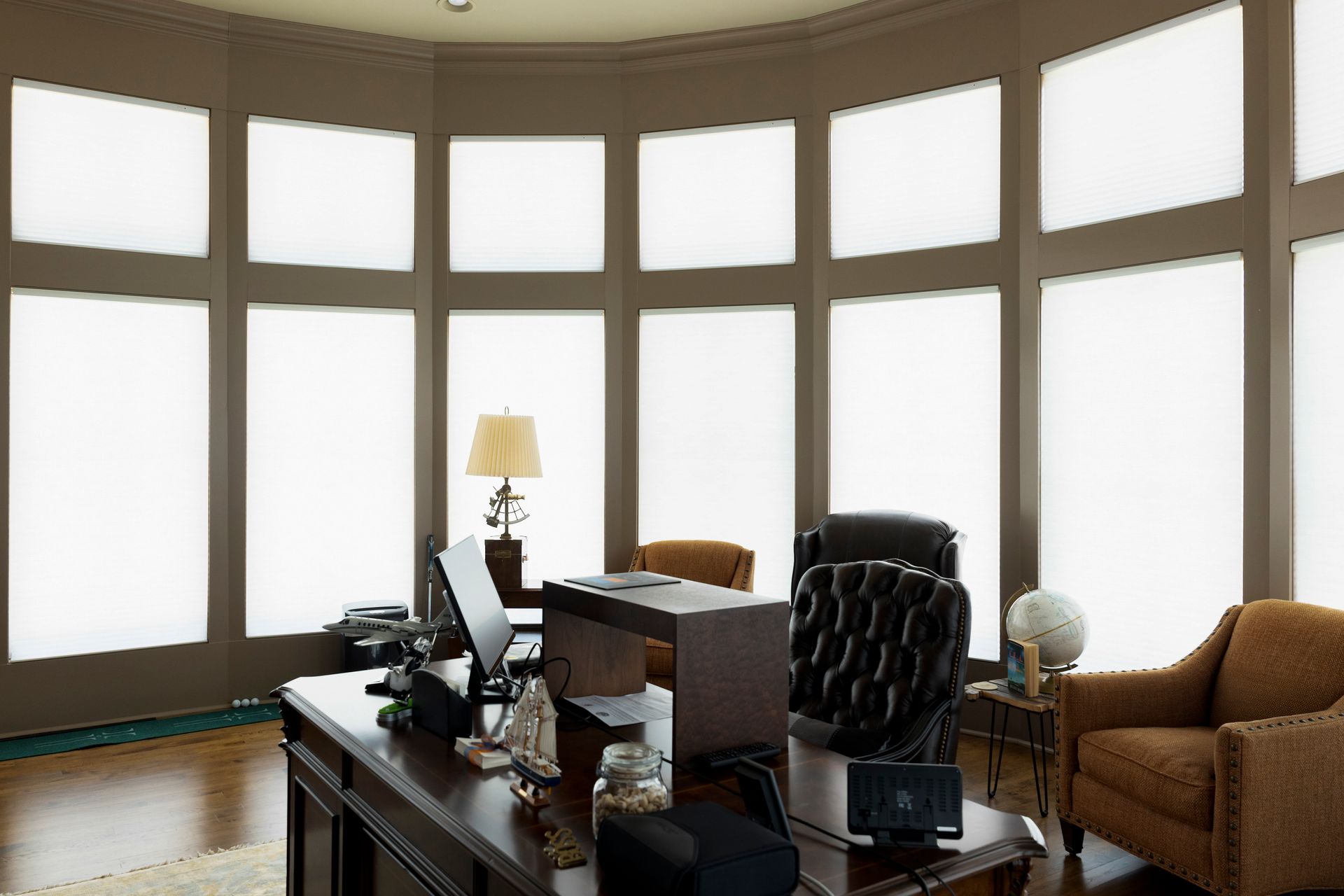
Whether you’re planning on large or small changes to your home’s interior in 2018, if window treatment changes are on your list, be sure to explore the incredible array of options available at  Just Blinds , Central Alabama’s premiere window dressing experts for 30 years and counting!  Contact us  to learn about our free on-site consultations, expert measuring, professional installation and top-flight customer service! We’ve been around for decades because we know how to  listen  to the needs and wishes of our customers, whether they’re shopping for a houseful of window treatments or just trying to enhance a single window!

Expert Advice by Just Blinds

By Autumn Hooper January 10, 2025
Sunshine can fill any room with a warm glow. It provides natural light and can even lift your mood. But there may be some rooms where you want both privacy and sunshine at the same time. You shouldn't have to block out the light to enjoy private rooms in your home. For these moments, having the right blinds or drapes can make all the difference. The answer is in sheer privacy, sheer and semi-sheer materials that let in the light without allowing others to see through your windows. This is your guide to private sunshine: how to enjoy your privacy and warm natural light in any room. Why Sheer Privacy Matters There are many situations where sheer privacy is ideal. Bedrooms are warm and welcoming when filled with natural light, but privacy is paramount. Sheer window treatments can also bring sunshine into your living room without broadcasting family activities to the neighborhood. And if natural light helps you stay focused in your office, you can maintain professional security without worries by hanging sheer blinds and drapes so your computer screen is never visible through the window. How can you achieve this perfect balance of sunshine and privacy? There are several types of blinds and drapes that can meet your needs. Woven and Fabric Blinds The right fabric or woven blinds can provide the perfect balance between light and privacy. Woven and fabric blinds are rarely completely opaque. Depending on your choice of material and weave, you can determine both how much light shines through and the level of visibility in your sheer material. Fabric blinds use woven fabric to block visual access through your window while also acting as a diffuser for the sunlight. Woven blinds are made of grass or reeds and provide a similar effect. This can be used to cast gentle glowing light into your room at slightly dimmer-than-normal levels while showing silhouettes or less. Slatted Blinds and Plantation Shutters The most traditional answer is slatted blinds and plantation shutters. These methods use opaque angled slats that open to allow in some light without creating an easy line-of-sight from anywhere that a person outside might reasonably be standing. Slats pointed up or down welcome sunshine from various angles during the day but cannot be seen through until the slats are nearly horizontal. Slatted blinds hang from the top, and the angle of the slats is controlled with a cord system. Today, pull cords and hanging loops are no longer used. Instead, a control wand or motorization is used to enhance home safety and convenience. Plantation shutters are wood structures that are permanently installed or fold out over your windows. The slats are structured and controlled by pushing a ridge bar on the back of the shutter slats themselves. Honeycomb Blinds Honeycomb blinds are a type of fabric blinds that use honeycomb cells to provide greater insulation. Honeycomb blinds are not just energy-efficient, they also provide greater privacy by implementing layered fabric to create the honeycomb air pockets. At the same time, the fabric used can bring in sunshine and act as a diffuser to spread gentle sunshine through your room. The honeycombs themselves also diffuse any silhouettes or shadows that might be seen through the fabric of the blind for greater privacy inside your rooms. Semi-Sheer Drapery If you prefer drapes, you can also select a sheer fabric as the innermost layer for your draperies. The fabric and the folds of the drapes combine to provide both a diffuser for sunshine and privacy. Drapery is the most likely to reveal shadows and silhouettes, but a style with more folds when the sheer layer is closed can obscure shapes and activities within to provide the privacy you need. Private Sundrenched Rooms with Just Blinds If you are looking to enjoy diffused sunshine and keep your rooms private at the same time, Just Blinds can help. Contact us today to explore your options for sheer privacy design with custom window treatments.
By Autumn Hooper December 10, 2024
Every year, the leading paint and decorator brands release their Color of the Year. Each organization theorizes which colors will be at the peak of interior design trends for the next 12 months, and the 2025 Colors of the Year have been released. If you want your interior decor to match the mood of the year with the latest magazine-spread designs and eye-catching arrangements, now is your chance. 2025: A Year of Bold and Somber Tones 2025 rings in a year of regally subdued tones. They are at once both bold and somber, creating relaxed yet elevated living spaces through strong colors and muted hues. This is a marked contrast from the light and airy palette created by the colors of the year from 2024 featuring soft pinks, warm honeys, and renewing blues. This year, the leading tones are dark red, deep purple, and dusty neutrals that make a space feel at once both cozy and formal. Stately Reds If you love dark reds from brick to mohogany, then this is your year. Both Behr and C2 have named dark yet natural-tone reds as their colors of the year. They are perfect to make a room feel luxe and stately without the overwhelming quality, making these reds the perfect base color for walls and a great accent in an elegant room. Rumors by Behr - A dusty red that is both light and dark at the same time. This muted town is a smooth, creamy rendition of faded brick that looks perfect with warm colors and red-hued wood furniture. Raku by C2 - A bold, dark mahogany red that looks great for interiors and exteriors inspired by the ancient Japanese tea ceremony. Regal Purples Purple is back in bold refrain for 2025 interior design. Between Violet by Minwax and Purple Basil by Glidden, you have an incredible palette to create the most regal of interiors, from primary colors to accents that pop. We love these rich tones that make any room stand out from the typical warm tones and neutrals that have ruled the roost for a decade. Violet by Minwax - Violet by Minwax is not your typical violet. It is a deep, rich aubergine, the color of royal robes and the most luxurious paint. This majestic color will stand out no matter how you use it. Purple Basil by Glidden - Purple Basil is a dusty reddish lavender that shares tones with charcoal and plum. It is somehow both somber and cheerful, warm yet subdued. Purple basil is a wonderful color for both primary walls and bold trim without overwhelming the space. Relaxed Blues Last year, blues were bright and full of energy with an aqua-green undercurrent. This year's blues are more relaxed, blending well with neutrals whether you're looking for a chill space or a summer tone. Quietude by HGTV / Sherwin Williams - Quietude is the eggshell of blues. It is soft and faintly blue in hue while still giving the light neutral feel of a nearly-white painted room. It has the faint hues of a lightly cloudy sky. Encore 8002 by Valspar - Encore 8002 is a bold, rich blue on the cheerful side of royal blue. It's deep but not dark, embracing what makes blue such a great color for decor. Mapped Blue by Dutch Paint Boys - Mapped Blue reflects green-blue theme of last year but with this year's dusty trend. It's soft and comforting but with a touch of surprise that's not your everyday medium blue. Subdued Neutrals While red, purple, and blue may be our boldest tones, it's neutrals that rule the 2025 Color of the Year list. From deep yet soft Truffle to warm almost-pink cinnamon, you will find a surprisingly gorgeous palette of neutrals to work with as primary, accent, and rich detail tones in any room design. These colors can fall into the background or make your room pop. Truffle by Stainmaster - Truffle is the darkest of the 2025 neutrals, blending honey with charcoal for a warm bold tone that looks amazing in boho or minimalist styles. Mochi by Little Greene - Mochi is a warm medium neutral that naturally supports wooden furniture of all hues. It has undertones of milkey coffee but reflects light in a way that still brightens a room. Caramelized by Dunn-Edwards - Caramelized is a tone that approaches boldly from the cheerful side, reminding us of dessert landscapes and faintly orange sunset skies. Cinnamon Slate by Benjamin - Cinnamon Slate is a soft neutral that is just this side of dusty pink. It's described as a dreamy, velvety purple and brown that can add subtle richness to any space. Mocha Mousse by Pantone - Mocha Mousee is a sophisticated neutral that reminds us of soft earth and smooth wood. Using the Colors of the Year to Inspire Your 2025 Interior Design These colors aren't just for paint, they can be used to enhance every element of your space. One of the best ways to introduce diversity and annual color trends into your home is through blinds and drapes. Choosing the perfect blinds can update your style to magazine-worthy arrangements for every year and season. Find the latest colors and styles at Just Blinds today.
Share by: