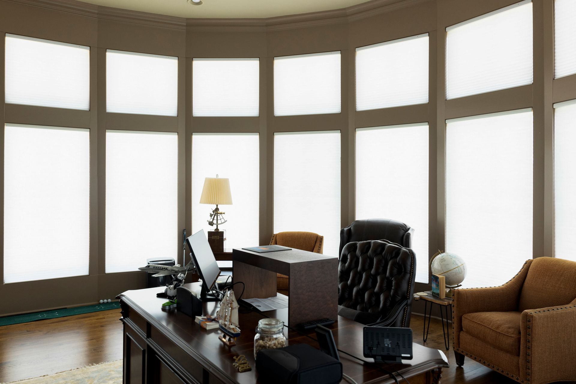
Custom blinds can transform the look of any room in the home. If you have a space looking for renovation or just built a brand new home, new blinds could make all the difference. However, don’t go with generic blinds. Although generic blinds may be less expensive, custom blinds are well worth the investment. They fit better, look nicer and hold up longer. All products at Just Blinds are made to compliment the room, while accenting or filtering window light. Our custom blinds are meant to fit into any room decor, and are fitted and installed by professionals. You may be thinking you can’t afford custom blinds after other renovation costs or the completion of a new build. If that’s the case, we have a few tips for you so you can make it happen. Check them out below:
- First of all, it may be less expensive than you think
- At Just Blinds , we always offer free consultations. Plus, we normally have promotions and limited time special offers on our products. Just contact us to find out which promotions we are currently providing.
- Try a money saving app
- This article from NerdWallet lists Qapital as the best app for saving money through setting a savings goal. Qapital saves the change every time you make a debit card transaction. For example, if you spend $10.48 cents on one transaction, Qapital automatically moves 57 cents over to your savings account. It allows you to track your savings until you have reached your goal. The best part about Qapital is that you don’t notice the change coming out of your account, but you would be surprised how fast it adds up!
- Try saving a little from each paycheck
- Every time you get paid, save a small amount of your paycheck. Try calculating 5-10%, or even more, of your paycheck to put into your savings account. This will help you save a consistent amount of money each month, which will get you closer to your goal.
- Save your money in cash
- If you have a safe place to store cash, like a locked safe at home, try putting your savings here. You won’t be looking at the balance every time you check your regular bank account online. It might help you to put it in the back of your mind, and resist spending it on impulse purchases.
- Put your savings in another account
- Banks are normally offering money to start a new account. Search for the best promotions, then try opening an account at one of these banks. Do not link a card to the account, or set up mobile banking. This makes your money less accessible, and you may be less likely to spend it.
- Save enough for a good down payment, then finance the rest.
- If you can save up a few hundred dollars for a down payment, you may feel better about being able to finance the remaining balance. Contact us to find out what financing options we may have available.
- Think of the reward!
- Once you’ve saved enough money, just think of how happy you will be customizing your new blinds! You can have your custom set of wood blinds , roman shades or custom draperies to compliment any room in your home. Plus, you will have access to our personal team of experts to measure and fit your blinds to any window you desire. Of course, our team also offers professional installation.
Start saving today, so you can enjoy your new custom blinds tomorrow. As always, if you have any questions about our products or special offers, please feel free to contact us .
Expert Advice by Just Blinds