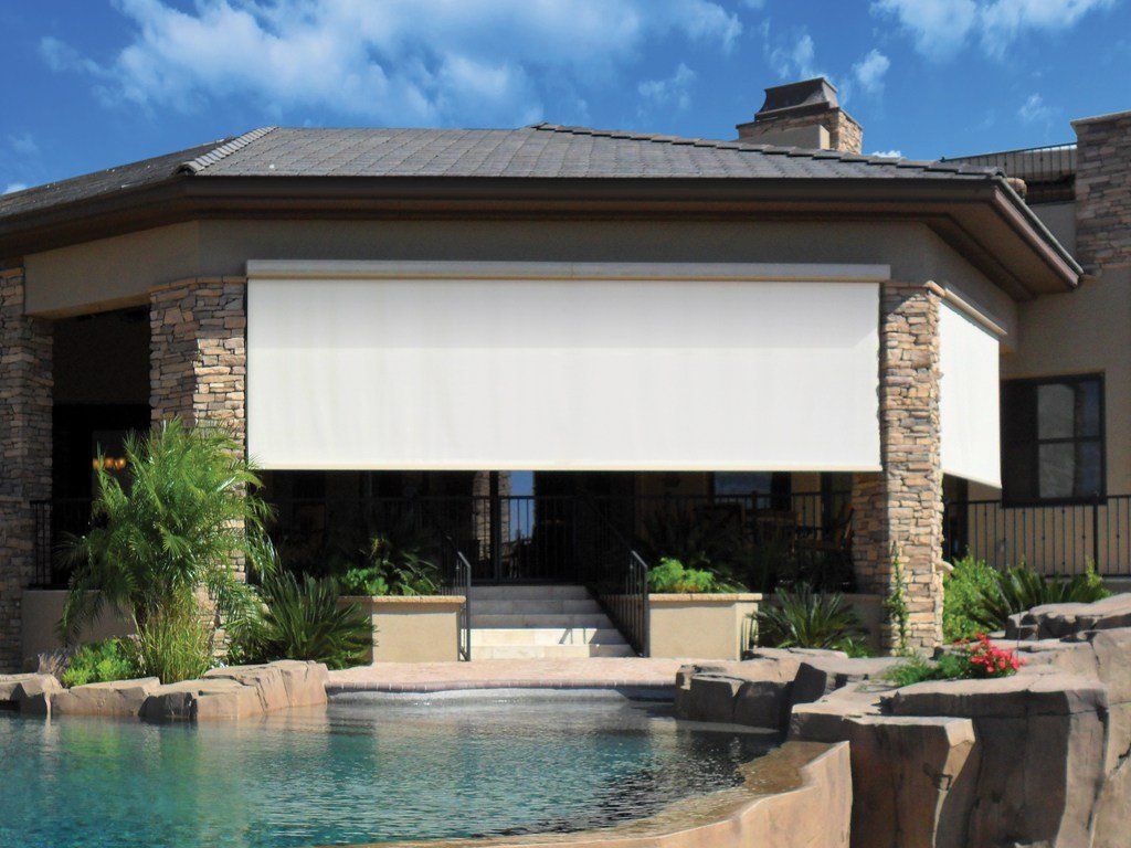
Outdoor shades are wonderful additions to your home. Not only do they allow you to enjoy mornings and evenings on your porch or patio in comfort, but they also protect you from some of the harshest side effects of the sun, including excessive UV exposure , which can lead to serious health consequences over time. If you have exterior shades installed, one of the best ways to protect your investment and ensure that your outdoor shades stand the test of time, protecting you and your family over the long haul, is to institute a routine cleaning and maintenance plan. How Often Should You Clean And Maintain Your Exterior Shades? Because needs will always vary by season and climate, it's best to visually inspect your exterior shades once a month. If you see any buildup of dust or pollen, or any obvious maintenance issues, address them immediately. At least once per quarter, you should also schedule a thorough cleaning and maintenance check. Every three months, around the time the seasons change, schedule a day to clean and thoroughly check your blinds for any routine maintenance. Particularly if you live in the Southeast, we recommend scheduling thorough cleaning and maintenance in January, April, July, and October. 3 Steps to Cleaning Your Home's Exterior Shades First, start by thoroughly cleaning your exterior shades. Step 1: Gather your cleaning supplies. You will need the following: A bucket and a mild cleaning agent A hose and water supply A soft brush or broom A soft cloth When it comes to your cleaning agent, be sure to avoid any solutions with harsh chemicals. If you haven't received information on any manufacturer-specific suggestions, we recommend using a mild dish soap diluted in water. Step 2: Dust away dirt and debris. Using your soft brush or broom, gently remove all excess buildup of dust, dirt, and debris. Make note of any trouble spots that will need more extensive cleaning. Step 3: Thoroughly clean your exterior shades. Begin by testing your cleaning solution in a small, hidden area. If you see any strong reaction, including erosion or discoloration, stop immediately and seek more information. Only if your shades respond well should you proceed with a full cleaning. Start by using your hose to gently rinse your exterior shades from top to bottom. Next, using your soft cloth, clean the shades, removing all accumulations of dirt and grime. After a final rinse with the hose, allow the shades to air dry in the sun. If necessary, repeat this step until your shades are fully clean. What Routine Maintenance Issues Should You Check For As You Clean? As you clean your exterior shades, keep your eyes peeled for any routine maintenance issues that may need to be addressed. Trouble spots to watch out for include the following: Fading color. Though color fading in itself is not an emergency, it can show that your exterior shades are beginning to show wear and tear. Assess the extent of the damage and consult with Just Blinds to evaluate the projected longevity of your current shades. Sagging shades. Sagging shades don't necessarily need to be replaced, but they may need to be re-tensioned. Check the external hardware and see if anything needs to be tightened up or replaced. Rips, tears, gaps, or holes. No matter how small, these issues need to be addressed immediately. Addressing these issues early can prevent the damage from growing, preventing more costly repairs down the line. Buy a patch kit and follow the instructions for sealing up any trouble spots. Just Blinds Is Here to Help To hear more about how to maintain your exterior shades, or to learn more about how outdoor shades can add value to your home and help you better enjoy your outdoor living areas by reducing heat, offering increased privacy, and lowering your UV exposure, feel free to contact us . We look forward to serving you.
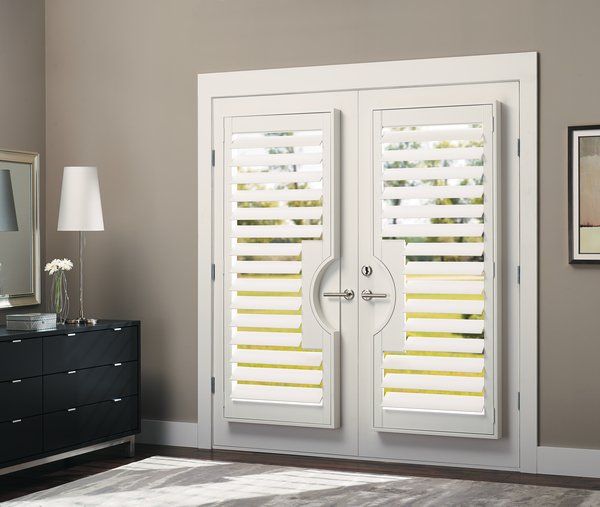
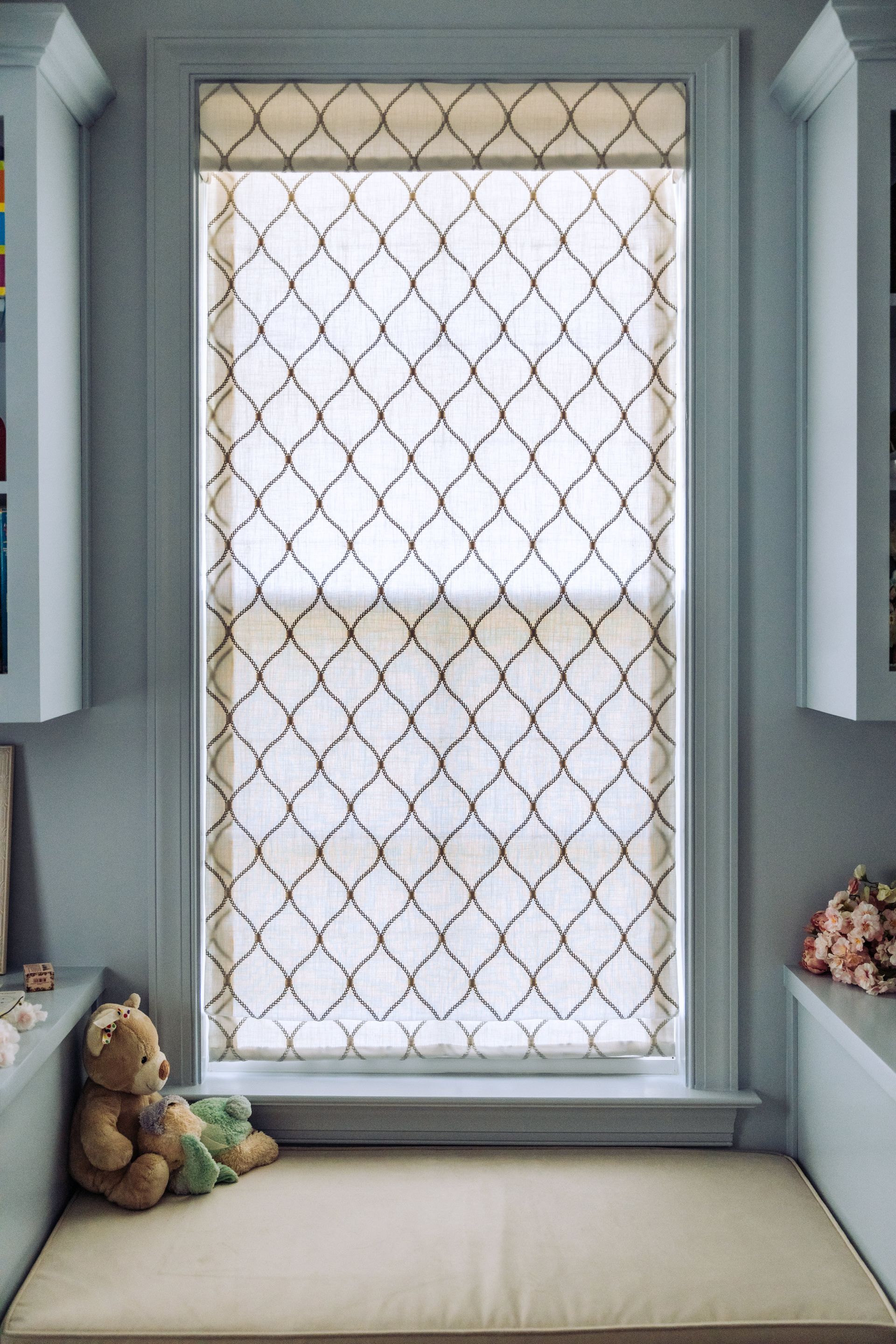
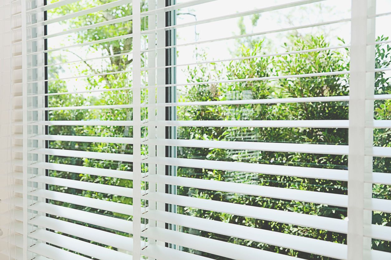
Kids' rooms can be a challenge to decorate, especially with younger kids who might not have developed their own taste yet. Window coverings are an area many parents neglect, but you can do some really fun things with them. So, here are some tips to make a kids' room interesting with blinds, shades, drapes, and other window dressing ideas. Safety First Before we get to the fun, though, we need to talk quickly about safety. Particularly, if you have young children, you should not use corded window coverings . Children can easily become tangled in the cords and may end up being strangled. This is particularly important when decorating rooms in which a child might spend time unattended. Also avoid putting cribs, playpens, beds, etc near windows. Use cordless blinds and shades instead. A perfect choice is cordless roller shades, that also don't have any cords between slats. They're also easy to clean. Light-Filtering Young kids often nap during the day. If their room gets a lot of light, consider blackout or light-filtering shades that you can close when they nap to help them get some sleep. You can also use these shades to keep the room from becoming glare central. White blackout shades can become invisible when not in use, so you can get the look of an undressed window. Glow-in-the-Dark On the other hand, many kids aren't hugely fond of total darkness at night. Glow-in-the-dark shades can help chase away the shadows and look cool. They typically fade after about thirty minutes, but usually kids are asleep by then. You can coordinate with other glow-in-the-dark accessories, such as ceiling stickers, for a particularly starry effect. Include Their Favorites These days, you can get all kinds of printed blinds. Does your little one love dinosaurs? You can get blinds with dinosaurs. Superheroes? Not a problem. If you can't get the exact fabric you want, it's not hugely difficult to buy the fabric and make blinds yourself...just make sure they're kid safe. As your kid gets older, they can pick out their own prints. Match Designs and Accent Colors Match blinds with lamp shades or curtains with accent colors to tie the room together. Your kids will start to develop a sense of style and adults often spend quite a bit of time there too. You can also put curtains over bookcases or toy storage to match the window decorations and make the room look less cluttered. You can, of course, always go with the classic of matching curtains and carpet, or choosing wooden blinds (for older kids) to go with wood flooring. Also, you can match curtains or blinds with your child's bedding for a coordinated look. Add Window Decals You want natural light during the day, but you also want something pretty? Window decals are a great answer and they come in a variety of kid-friendly designs. Teddy bears? Dinosaurs? Puppy dogs? Whatever your child wants, you can probably find it. Putting them behind curtains with a similar design means that day and night complement one another. Floor Length Curtains Small kids love floor length curtains...they can hide behind them. Choose designs that match something else in the room, but also bear in mind that a cool pole lets in light; you may want to layer blinds behind them to make sure you can get the room dark enough for your child to sleep. Bright prints and primary colors work well here. Let Them Have Fun And for one last fun idea...get transparent curtains or plain roller blades and let the kids decorate them with stickers, finger painting, felt, or whatever you have at hand. This gives your kids the ultimate personal look for their room...although they might get embarrassed by it in a few years! Parents should, of course, supervise and help and it may be best to do the decorating and then hang so kids can get to the top. Decorating a kids' room is challenging...but also a lot of fun. The right window treatments can make a huge difference. Choose child-safe treatments, but also consider these ideas...and contact Just Blinds for even more suggestions.
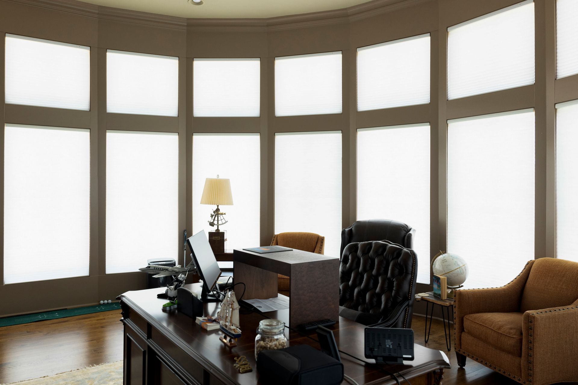
Lake homes are among the most desired types of properties out there, and the added value that these properties can fetch is nothing to brush aside. In fact, according to HomeLight , lakefront properties consistently outperform other homes in terms of resale value: Thanks to the law of limited supply, lakefront properties generally come with a higher price tag than their inland counterparts. Although waterfront properties fluctuate in value like the rest of the real estate market, they consistently sell at a higher price than homes that are not on the water. As such, if you are the fortunate owner of lakefront property, you should do everything in your power to maintain that property to the highest standards and keep it fully equipped with the most desirable features. Among the features that you ought to include: Exterior shades! What Value Do Exterior Shades Add to a Lakefront Home? There are a lot of different things that one might choose to do to increase the value of their lakefront home, but few will provide as much benefit as adding exterior shades. Here are some reasons why you should consider this addition: Reduce Exposure to the Sun Without Hampering the View A major part of the appeal of lakefront homes is the fact that they tend to feature stunning views of the body of water on which they rest. You certainly wouldn't want to spoil that view by obstructing it. At the same time, you still want protection from sunlight streaming directly into your eyes. Fortunately, exterior shades offer the best of both worlds. They will: Reduce direct exposure to sunlight Keep internal temperatures within your home cooler Maintain that beautiful lakeside view that you desire Improve Your Property's Privacy Sure, it is nice to be neighborly when you can, but no one can fault you for also wanting a little privacy while you are out at your lakefront property. Since lakefront properties are typically situated near other homes, docks, and other areas accessible to the public, you should consider exterior shades to maintain your privacy without completely isolating yourself from the outside world. Exterior shades help reduce visibility into your home from outside docks, neighborhood houses, and more. If you want to enjoy your sanctuary without full isolation, then exterior shades are the way to go. Keeps Bugs and Grime Away Spend any time on the lake, and you will quickly realize just how attractive a body of water is to insects and bugs. Additionally, windy conditions can bring pollen, leaves, and other debris into your home. Exterior shades help to keep all of that out of your home and allows you to enjoy your lakefront home for all that it has to offer. Are There Other Reasons to Consider Exterior Shades? You better believe there are additional reasons to consider installing exterior shades. Namely, they add a lot of value to the home because they create a space that is both comfortable and low-maintenance. Many of today's buyers are looking for both of those attributes when they go house hunting. They want to see that any home that they might purchase isn't going to cause them an excessive amount of effort and grief to make it a comfortable space to spend some time. Exterior shades go a long way towards making that case. Besides that, exterior shades are highly durable and don't need to be cleaned often. They will help make your home more energy-efficient by naturally lowering the internal temperature. Plus, these shades help you to extend the portion of your home that you can use for living and recreational purposes. By providing additional shade, exterior shades can help keep certain areas cool enough to enjoy even in the heat of summer. With all of this in mind, reach out and contact us today to schedule an appointment for getting exterior shades put on your lakefront property. It can be one of the smartest investments you ever make.
You might have an interior design planned out. Whether it's for a new house or you're updating your room's look, window coverings cannot be ignored. The type you choose shouldn't clash with the rest of the space. Fabric Roman shades are a great option to add to your home to give it a unique look. Here are seven reasons why they are the quiet hero in any room. 1. A Variety of Colors and Patterns A cohesive style is important for any living space. Fabric Roman shades can add to it instead of ruining it. One of the ways they make interior design more amazing is through variety. You can find these shades in all kinds of colors and patterns. So, you are free to stick to your favorite color palette. Fabric Roman shades blend seamlessly into a space by complementing the rest of the room. Some patterns can help make your home more unique. Whether you want a calm atmosphere or a sophisticated look, the variety of fabric Roman shades can deliver. 2. Layers Fabric Roman shades are great if you are in the mood for layers. You can add curtains over the shades to improve a room's richness. Your room will seem as if it has more depth while creating the desired mood. You might have curtains already picked out. Since fabric Roman shades have a wide range of colors, you don't have to worry about any mismatches. 3. Improves Small Rooms The wrong curtain or shade can make a small room feel as if it has even less space. Avoid bulky drapes and go with fabric Roman shades. These shades get mounted close to the window to help you save space in your carefully crafted design. Another reason fabric Roman shades are a lifesaver for smaller spaces is that they can offer light control. More natural light in a room can make it appear bigger. 4. Privacy Control Privacy is an important aspect to consider when buying window coverings. Sheer material is a suitable option that provides a level of visibility to the outdoors. Alternatively, a blackout material can help you gain a sense of solitude when you need it. Laying your fabric Roman shades with another curtain also provides you with more privacy control. You can feel comfortable in your own home without sacrificing your style. 5. Insulation Another way Roman shades improve the interior home is through insulation. Some fabrics are thick or have a thermal lining. Examples of what you can use include dense cotton and wool. The transfer of heat through these fabrics is minimal. During colder weather, fabric Roman shades help you remain cozy while you relax. Less heat enters the room during the summer months. 6. A Timeless Look Trends come and go. Some interior design options from decades ago can make a room appear dated. However, Roman shades have been around for a long time. Your room will still be in style no matter the year. Choosing the right fabric helps improve the timelessness of a space's design. You can continue to impress guests for a long time. 7. Safe to Use Some fabric Roman shade options come with the classic cord to raise and lower them. A cord, however, can pose an issue if small children or pets are nearby. For instance, cats may play with it and end up getting entangled. Children under eight have a higher risk of getting hurt. Plenty of Roman shades have cordless and motorized control features to ensure safety. They are straightforward to use, and there is a lower chance of an accident. Decorating your room can be a struggle at times. Finding the right window coverings can make a difference. We at Just Blinds aim to help you find the right shades for your house. Feel free to contact us at any time to discover what fabric Roman shade options are available.
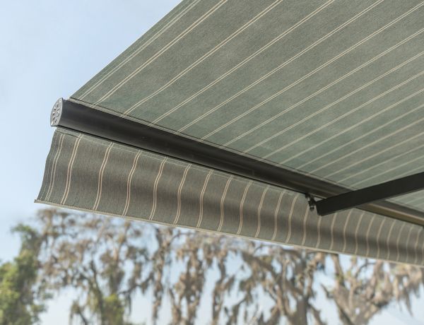
Alabama often "enjoys" heat...sometimes excessive heat. Protecting yourself and your home from the southern sun helps you stay more comfortable and healthier, and keeps your cooling costs down. Which is where motorized retractable awnings come in. What is a Motorized Retractable Awning? Awnings are designed to extend out from your home or building, providing extra coverage for your home, and providing extra shade. Retractable awnings offer improved versatility and convenience, allowing you to retract the awning when not in use or to allow more heat on cooler days. Motorized retractable awnings can be extended or retracted at the push of a button, and many come with remote controls or smart home integration. This means you can extend your awning from anywhere, and don't have to engage in physical effort. Why Choose a Motorized Retractable Awning? In addition to convenience, motorized retractable awnings have a number of benefits. These include: As mentioned, modern motorized awnings can be extended or retracted using a remote control or smart home devices. They can also be extended and retracted manually. The awning protects your patio furniture from rain and wind, while providing shade on days when you need it or allowing the sun in when its a little cooler. You can enjoy your patio all year round. Retractable awnings look good whether they are extended or retracted. Retractable awnings can be kept out to keep the sun out of your home, reducing cooling bills. During the winter, you can retract the awning and let your house absorb sun from south-facing windows Because you retract them when not in use, retractable awnings tend to last longer than fixed ones. They don't fade in the sun, aren't torn by the rain, and the fabric and frame are more protected from rotting. Retractable awnings improve curb appeal and can increase the value of your home. However, they are cheaper than a permanent roof over your patio, and with a front screen option will keep bugs out just as well. Retractable awnings are also easier to install than fixed awnings. While they still need to be installed precisely, they don't require as heavy support structures. You can control how much you extend the awning to match the conditions...it can be fully retracted, fully extended, or partially extended to provide just a bit of shade. We have now added SunPro Retractable Awnings to our range so you can get these benefits and then some. Why Choose SunPro? SunPro motorized retractable awnings integrate with most smart home devices and also come with a wireless remote. They can be adjusted to precisely block the sun and come with built-in, dimmable LED lights so you can use your patio at night. The lights can be adjusted using the same remote! These custom-sized awnings can be made to fit any home, and the frames and housing come in white, bronze, beige, and black to go with your aesthetic. You can also add things like front screens, wind sensors (which automatically retract the awning when the wind hits a certain speed, preventing damage). There are 30 different fabric colors in stock, and a 10-year warranty. We can install a SunPro retractable awning in either standard or custom colors, in any space including bay mount brackets, soffit and roof brackets, and cross arms for narrow spaces. If you need more shade on your patio, or to put shade over a window to reduce your cooling costs in Alabama's heat, contact Just Blinds . We can look at your home and help with a custom motorized retractable awning that will look good and protect you and your home from the heat and sun. We also provide other window coverings such as blinds and plantation shutters.
Windows give a home warmth, light, and a view of the outside world. But with the right treatments, you can also use your windows to make your home feel cozy. Coziness is a semse of comfort and familiarity. It defines a charm that feels like home, whether it's the coziness of a warm room in winter, your movie den in the summer.
Your selection of window treatment products and services is not merely about getting a job done. Rather, if you look hard enough, you can find direct correlations between the type of person that you are and the window treatment that you select. We have created this personality-based guide to help you best discover what kind of window treatment truly matches your spirit.
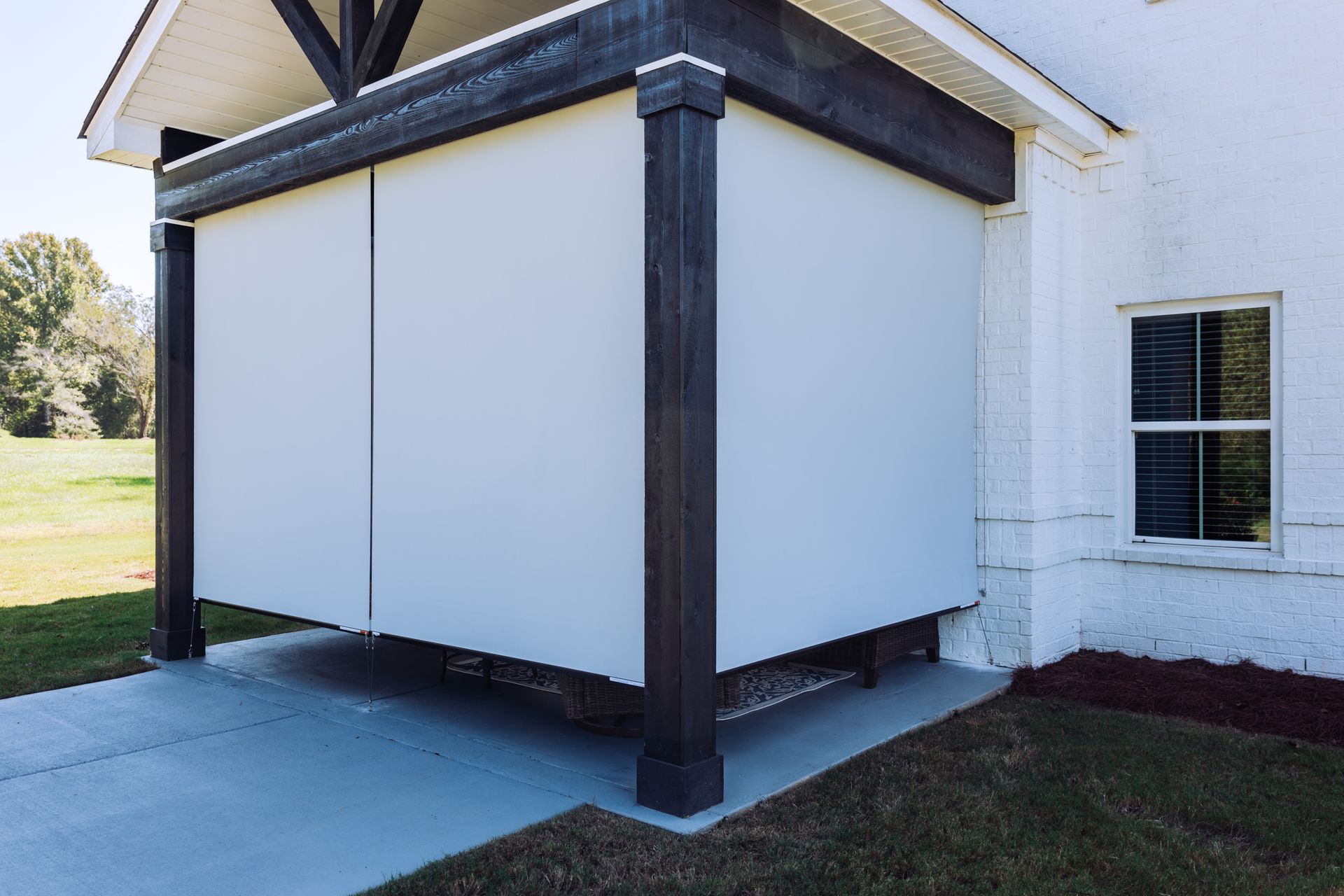
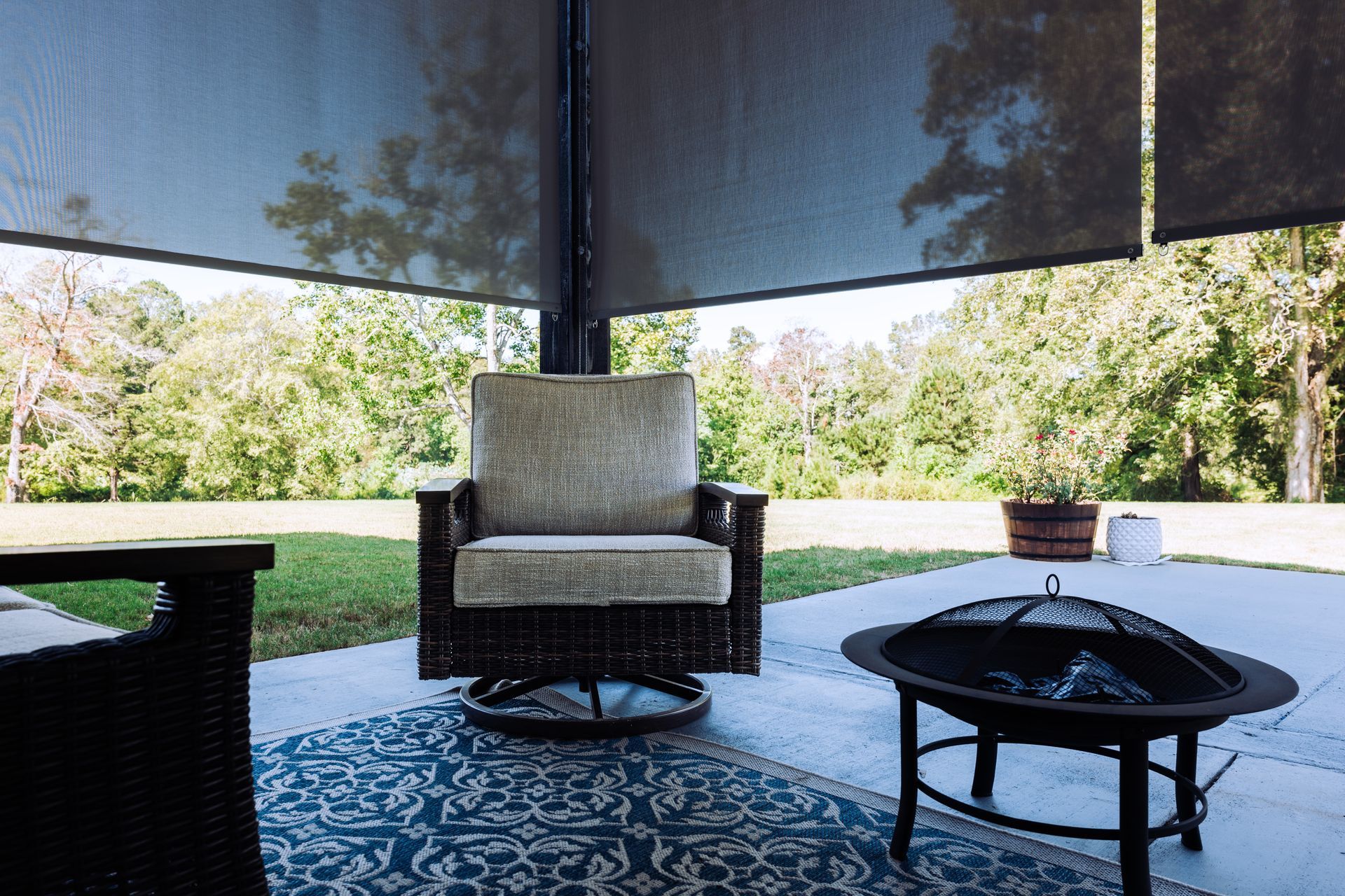
We all know and understand the concept of installing outdoor shades on a patio. It is the classic way to create a cool and comfortable space for yourself and your friends to spend some quality time together outdoors. There is nothing wrong with that, but it is limiting to think that the patio is the only part of one's property where outdoor shades are appropriate.
One of the most frustrating things that can happen to someone trying to improve their home is to find that they have somehow made a common mistake. That person will be upset that they didn't stop and do a little research prior to making a change. That is why you are here today, and that is why we want to provide you with some details about the most common mistakes that people tend to make when putting up blinds in various rooms. Let's also examine how you can avoid making those same mistakes.